
To view this support article as PDF, click HERE
Using the updated "Map Selected" tool is easy and now has lots of new features.
1. Make a selection of records in your Databank
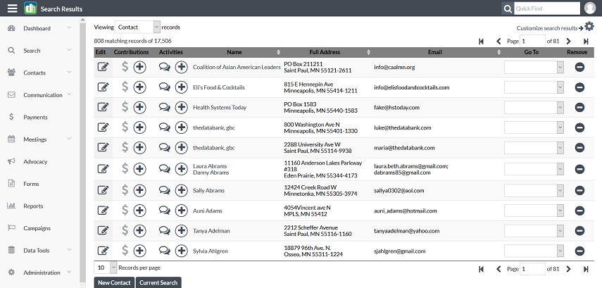
For this example, we have run a search on everyone that is a donor that lives in Minnesota and has an email address. We want to map these to see where the best location would be to hold our annual Gala.
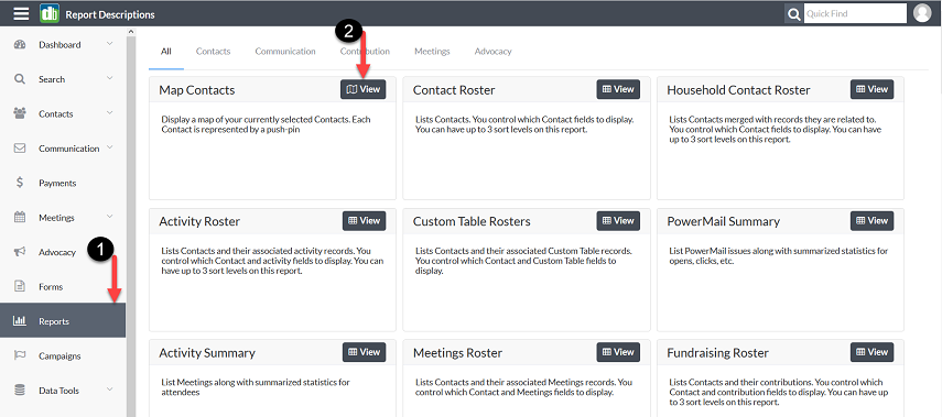
2. Map Selected
1. Go to Reports
2. Select Map Contacts
You now have your map!
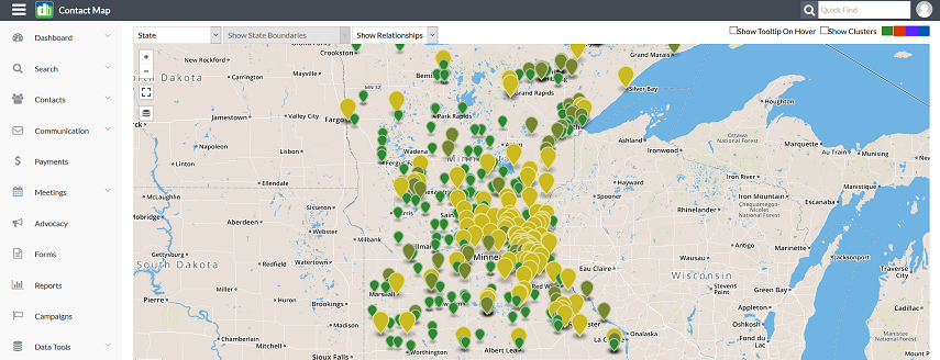
Your current contact selection is mapped, up to 2000 markers per map. Marker size and color are determined by the contact's importance to the organization: Larger markers are for more engaged contacts (Donors, Activists, Meeting attendees).
Quick Guide to Map Functions
Map-Zoom Buttons
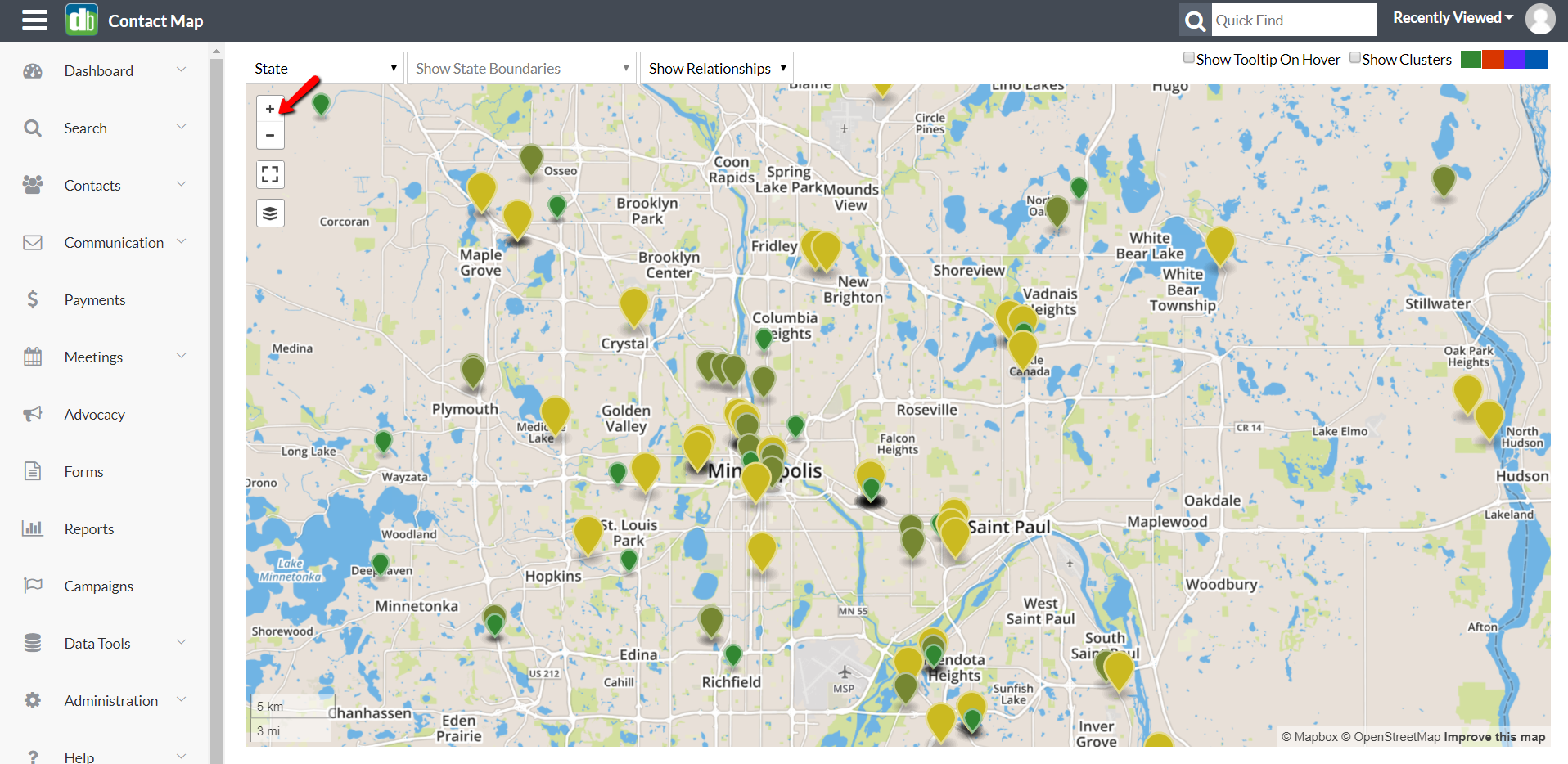
Click to zoom in or out on a location. You can also zoom the map by scrolling the mouse wheel, pinching the map on a mobile device, double-clicking the mouse (or double-tapping on a mobile device) or by pressing Ctrl-PgUp and Ctrl-PgDn on the keyboard. Pan the map using the arrow keys or by clicking and dragging.
Full-Screen Button
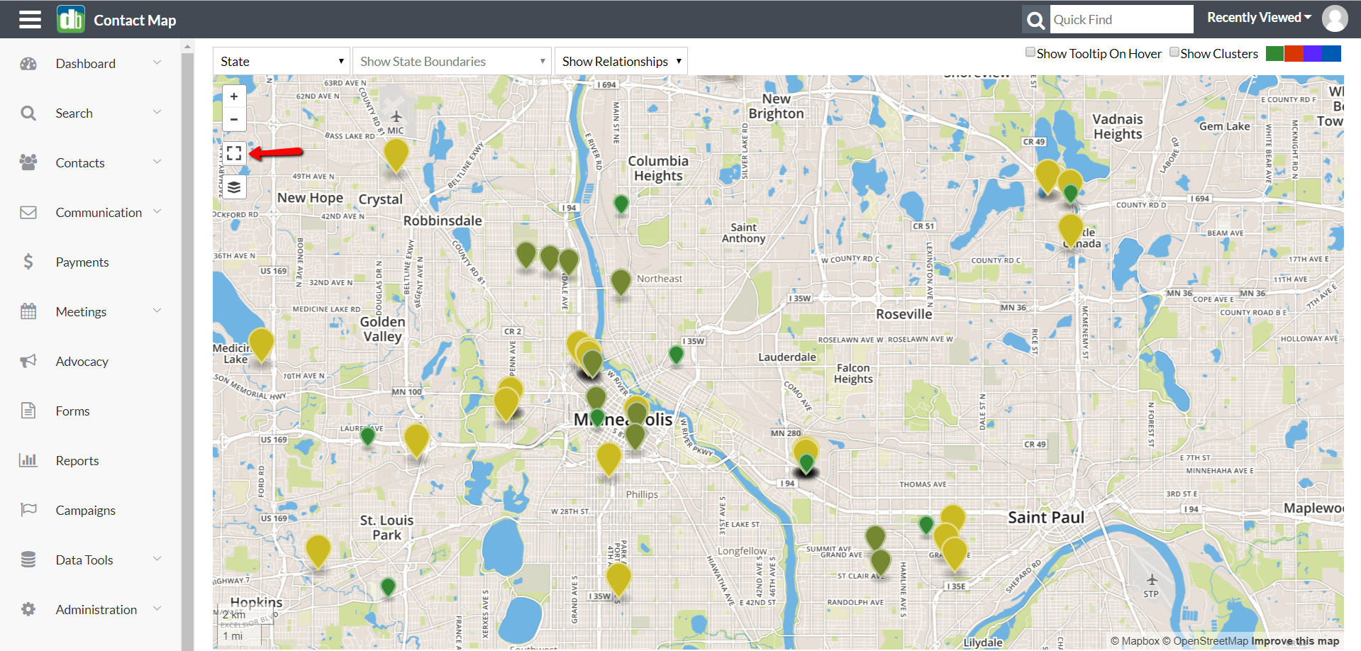
Click to make the map fill up your entire monitor. Click it again, or press Esc, to revert.
Layer Selector
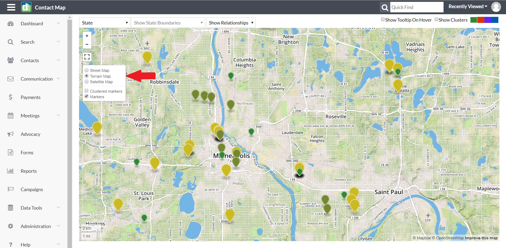
Hover over this icon to drop down a list of currently available map layers. Select among base layers, or click checkboxes to turn on and off the data layers. Standard base layers include: Streets, Terrain, and Satellite views, and standard data layers include member markers, clustered markers, and in-state borders (counties, Congressional Districts and state legislative districts).
State Selector
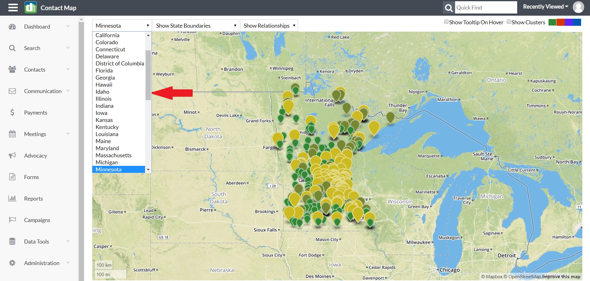
With this tool you can zoom and center the map on the chosen state, and make the Boundaries drop down available for that state.
For this example, we will choose Minnesota.
Boundary Selector
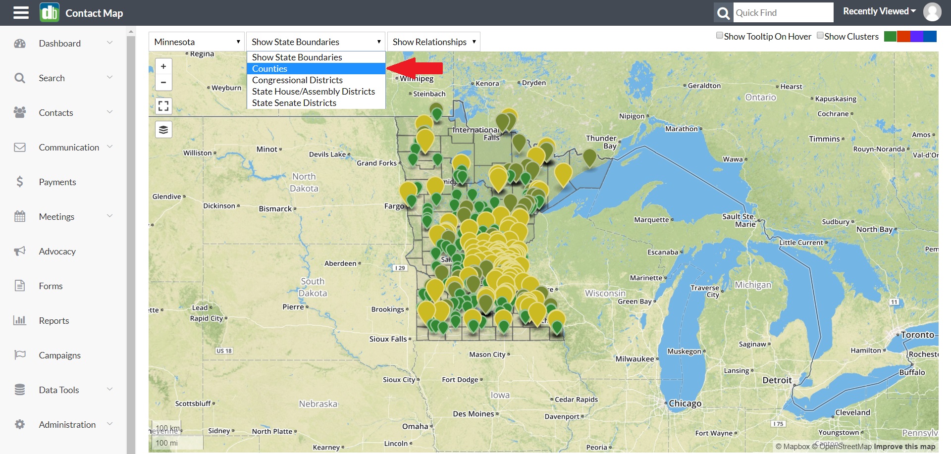
With this tool you can choose to display Counties, Congressional Districts, State Senate or State House/Assembly for the chosen state.
For this example we chose to show Counties.
Relationship Sector
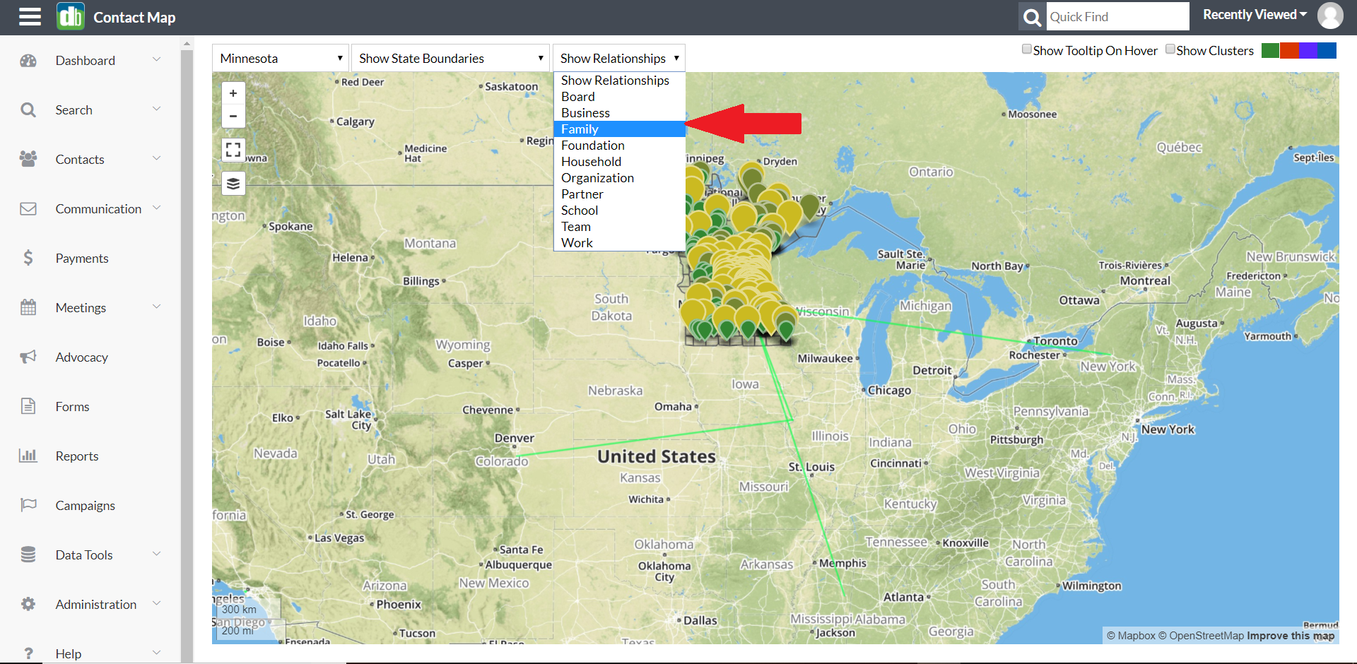
With this tool you can display all relationships of the selected type as lines connecting contacts on the map.
For this example we have chosen Family relationships. These are indicated by the green lines.
1. By clicking on the Relationship Line you can view what type of relationship it is and to whom.
2. You can click on the record name to go directly to that member record in your databank.
Show Tool tip On Hover
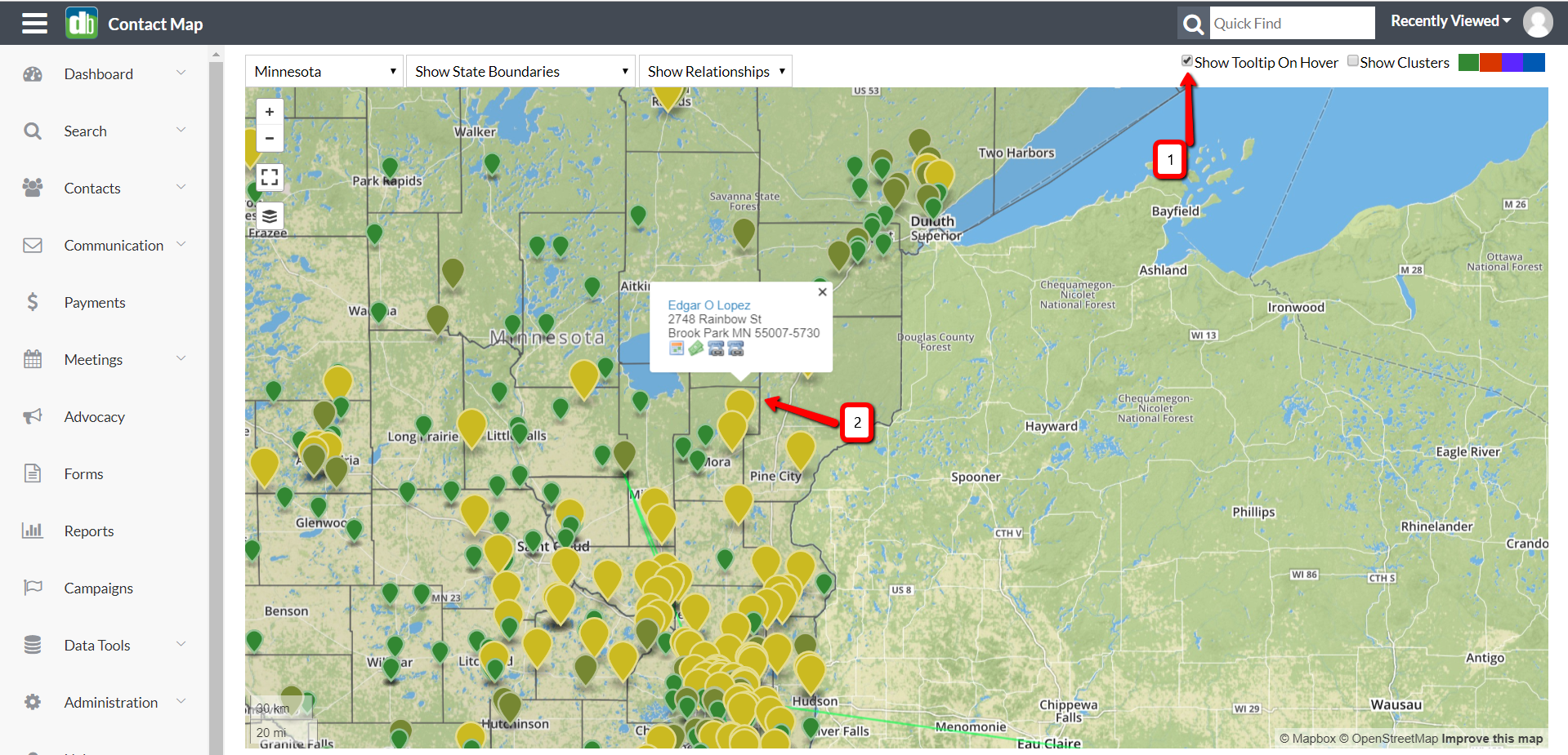
By default, a popup with information about a member will appear when the marker is clicked. When this box is checked, the popup will appear when the mouse is hovered over a marker.
Show Clusters
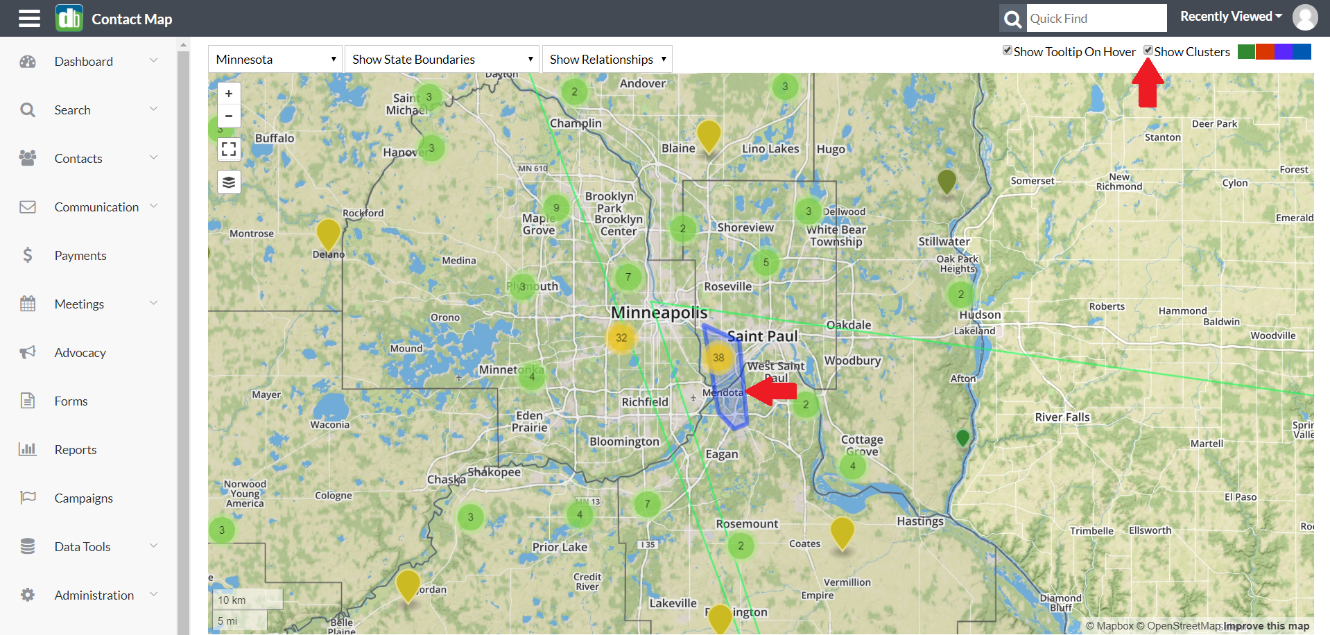
Show Clusters:
1. When checked, markers are grouped together to show the total number of data points in an area.
2. When hovering the mouse over a clustered marker, a blue outline appears showing the region that contains all the counted markers.
Marker Color Selector

Click to change the marker colors.
Comments
0 comments
Please sign in to leave a comment.