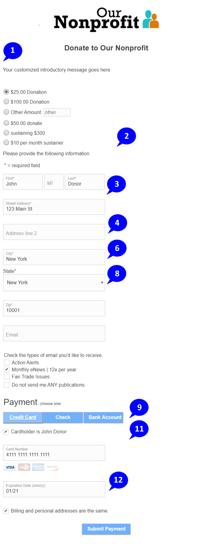
The July 2020 update to forms makes many changes that modernize them and make them more mobile friendly. Check out this sample donation form to experience filling out a form with the updates.
|
General changes:
- Everything is neatly lined up on the left, making it easier for users to focus on entering data.
- Input boxes, radio buttons, check boxes, and buttons are all larger, with more space between them, to make them easier to use on touch devices such as phones and tablets.
- All text inputs and drop downs are the same width, so the right side is more uniform too.
- Labels are no longer at the left, they're inside the input box whenever possible.
- With everything bigger, forms are longer, so more scrolling is required. Having labels inside the prompts helps mitigate this.
- If a field contains data, the label is smaller and tucked up into the top left corner.
- What you can't see from an image is that, when a donor clicks or taps an empty field, the label slides to the upper left while reducing in size. You can experience this in the sample donation form.
- For drop downs, text areas, and fields that have long labels, the label is displayed above the field.
- Gray is gone, replaced by a "highlight" color that you can choose. The default highlight color is the light blue with white text that you see in the image.
- Highlight colors are used in cart headers, buttons, section headers, meeting calendars and date pickers, and more. When you choose your own highlight colors, you can match these elements more closely to your branding.
- The card holder name is displayed next to a check box. If the card holder name is different than the donor name, the box can be un-checked and an alternate name entered. Most donors use their own cards, so this generally simplifies while saving space.
- The card expiration is a single input box requesting mm/yy format, instead of two drop downs. This way the donor keeps their hands on the keyboard instead of switching to the mouse.
|
 |
|
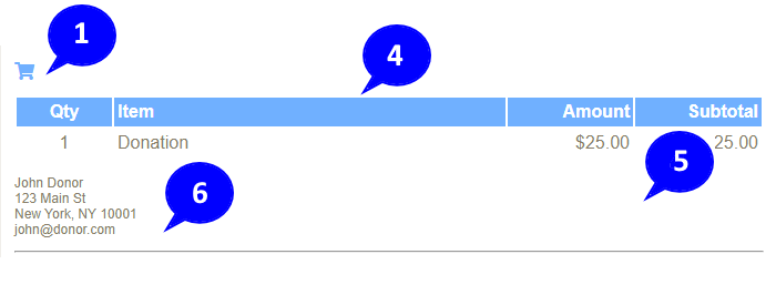
Changes to carts:
- Carts will be hidden when a page initially displays. A cart icon will display instead. Clicking the icon toggles between showing and hiding the cart.
- Making the cart accessible, but not visible, is the norm in modern systems.
- Hiding the cart keeps the donor focused on filling out the form. They don't have to scroll past the cart to get to the data entry.
- Cart column headers use the highlight colors.
- Cart text has a lighter color to de-emphasize it compared to the form content. You can choose the cart text color in the Forms tool in your Databank.
- Name and address information, along with other cart information that may have been collected, is displayed in a smaller font, again to de-emphasize the cart content vs. the form content.
- Cart information will display on thank you pages where the replacement variables (e.g., [donation-info]) say to display it. If no replacement variables are used, the cart will be hidden by default, as on other pages.
|
 |
| |
|


Comments
0 comments
Please sign in to leave a comment.